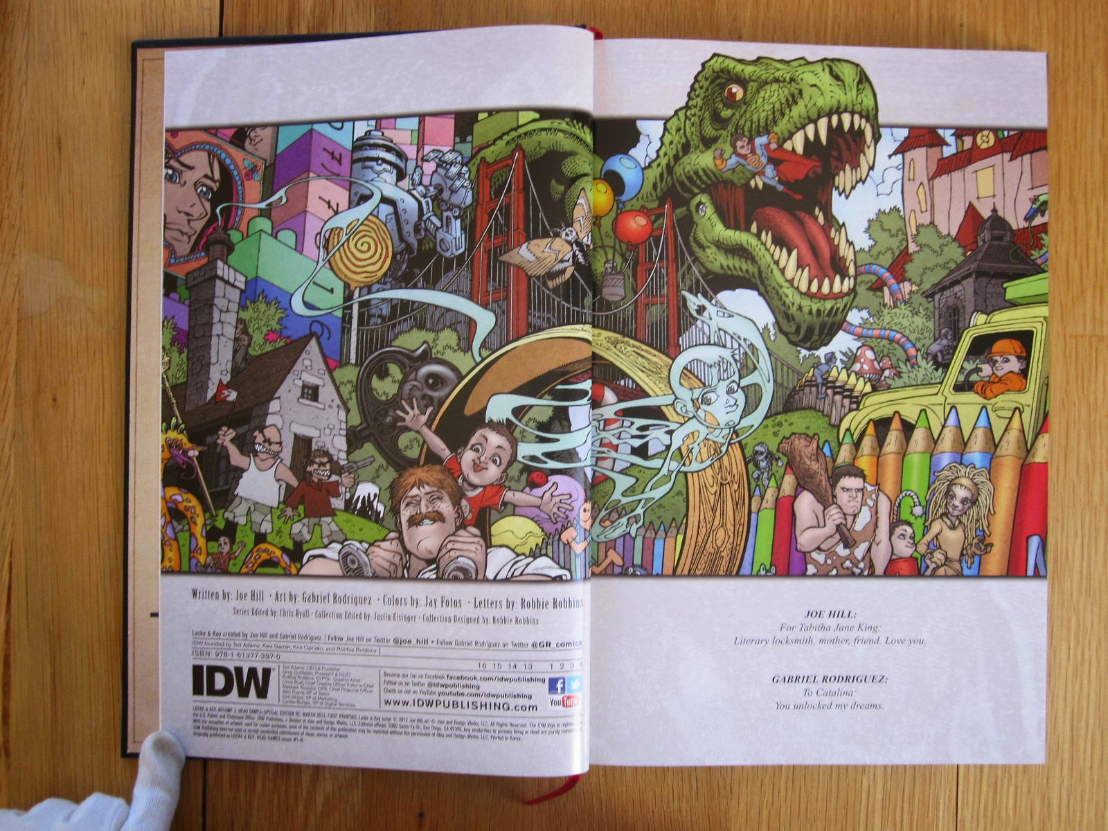
Script by Joe Hill, art by Gabriel Rodriguez with color by Jay Fotos and lettering by Robbie Robbins. All illustrations used here are ©Joe Hill and IDW. The "regular" Special Edition collection of the series is described
here.
This book has been published and exclusively distributed by IDW in March 2013, as a "Red Label" edition in their "IDW Limited" line. In this line, there are three labels in my understanding, Red (a few hundred of signed copies), Black and Blue (limited to a few copies each and displaying other exclusive incentives). There are several
Black and Blue Label associated with this book.
 |
| IDW take great care of their books |
 |
| is it the so called "red" label? |
This limited edition (175$) comes with a custom designed tray case comprising:
- an exclusive portfolio of pictures taken by Shane Leonard related to Key House
- the oversized limited hardcover edition of Head Games here signed and numbered
- a hidden compartment containing pages from the Locke Family Journal and the Head key
 |
| I LOVE this edition! |
 |
| right on top the portfolio |
 |
| right the main hardcover book |
 |
| center the "hidden" compartment |
 |
| pages from the Locke Family Journal and Head key |
Let's begin with the
main book. With its absolutely gorgeous carved leather cover, it really is a perfect example of fine crafting. The book designed by Robbie Robbins and edited by Justin Eisinger (13.5 x 9 inches or 35 x 23 cm, ISBN 978-1-61377-397-0 note that this ISBN correspond to the regular oversized hardcover edition, 278 pages) is printed on thick glossy paper and features a red satin ribbon bookmark. On a picture below it is compared in size with the French edition of
Head Games HC that has the same size than the original comics.
The book displays different second and third of cover as well as a tracing paper overlay for the title page. This is a signed (Joe Hill, Gabriel Rodriguez, Jay Fotos, Robbie Robbins, Shane Leonard) hand numbered edition with a limited print run (250 copies, mine being #227).
 |
| the tracing paper overlay |
This book reprint the entire
Head Games series (originally published as 6 issues in 2009), which is the second part of the whole
Locke & Key saga. The covers are included in virgin form (alongside the main material or in the gallery section) as well as the Locke Family Journal from the paperbacks.
 |
| Gabe Rodriguez art absolutely deserves this printing size (at least) |
The main part is followed by a 7 pages section art gallery (all by Gabriel Rodriguez) including virgin covers, Key House views and
Locke & Key Who's Who.
Then follows a comprehensive section (107 pages!) featuring Joe Hill's complete scripts for the series. The book ends on short biographies of the authors.
Now, let's take a look at the
portfolio embed in a beautiful hardcover sheath (displaying the so called IDW "Red Label"). It contains eight A4 pictures by Shane Leonard capturing key moments or places from the series.
 |
| notice the red varnished IDW label |
 |
| back of all the photos |
And we will finish with the
hidden compartment containing the Head key and 3 excerpts from the Locke Family Journal:
 |
| illustration on the back of the secret drawer bottom |
 |
| parchment style! |
 |
| the engraved Head key (kids don't try it at home!) |
IDW people have been nice enough to include for free in my shipment this other portfolio containing an original unique signed piece of art by Alan Robert. I am very grateful and lucky because it's Joe Hill who is represented in this drawing (I collect these kind of piece of art), and I am quite found of Life of Agony. And now I kind of own a "Black Label" edition.
 |
| notice the black varnished IDW label |
 |
| 1 of 1, yeah baby! |