Script Alan Moore, art Dave Gibbons, re-colored by John Higgins. All material is ©DC Comics. For a complete list of all books reviewed in this blog, please visit the
index page.
 |
| notice the numbered spines |
 |
| top of the box set |
 |
| bottom of the box set |
This collector's edition was published by DC Comics in November 2016 (ISBN: 978-1-4012-7034-6, 7.5 x 11.5 x 4.5 inches or 19 x 29 x 11.5 cm, 12 x 32 pages, $125 cover price). Five out of six Watchmen members can be seen on the box set cover. The illustration related to Rorschach is on the bottom of the box set. This box set was earlier advertised with the following design:
This set is comprised of 12 hardcovers (11 x 7.3 inches or 28 x 18.5 cm) slightly bigger than a regular comic size (a picture below compares one of the hardcover with the original comic and DC Absolute edition).
 |
| left hand side the Absolute edition inner book, middle one hardcover from this edition, right hand side original issue #10 |
 |
| sadly and again, the binding is tightly glued |
Notice that the overall size and design of this collector's slipcase box set is very similar to the
Dark Knight III collector's box set (as well as the
Batman Return of The Dark Knight collector's box set): covers of the slipcase form a single illustration, and the spines are numbered at the bottom. The publisher refers to this collected line as slipcase editions at
DC’s Deluxe Edition trim size.
Each hardcover book in the slipcase is printed on glossy paper. The aim of DC was to reprint each issue of the original
Watchmen miniseries in its own hardcover volume. Thus, it is a "collector's edition" without any extra section. The following pictures illustrate the differences between the original comics and these hardcovers (I have used issues #1 and #10 to do the comparison). It can be seen above and further in this article that all hardcovers use only a white font for the "Watchmen" title whereas each original comic uses a different color.
 |
| back cover of issue #10 comparison, notice the changes in the clock design |
Second and third of covers of the original comics evolved from one issue to the other, following the "Watchmen" letters. In this box set, the "Watchmen" word is completely formed in each hardcover using second and third of covers, and additional opening and finishing pages.
 |
| second of covers of issue #10 comparison, right hand side original issue #10 |
 |
| original issue #10 third of cover (second part of the letter "M") |
 |
| additional opening page, issue #1 of this box set edition |
 |
| additional finishing page, issue #1 of this box set edition |
 |
| third of cover, issue #10 of this box set |
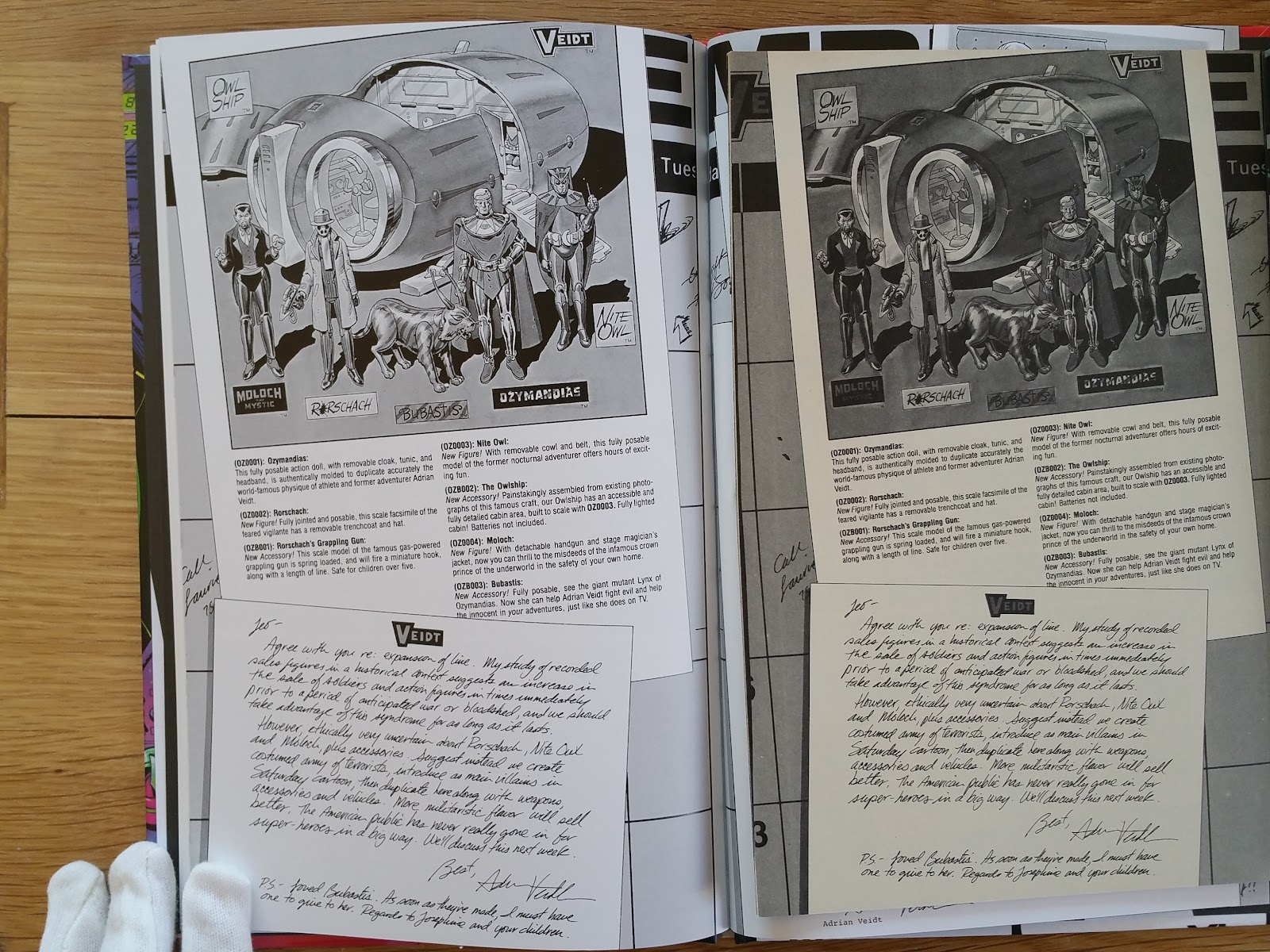
More important, is probably the color rendering. This edition uses the 2005 material (new colorization by John Higgins, art and color reconstruction). For instance, the Tales of The Black Frighter panels are printed with a grainy effect. Being printed on glossy plain white paper, the colors looks of course much brighter than the original comics (and slightly brighter than the Absolute edition).
Below are excerpts of the credit page from this box set edition (left hand side) and the 2005 Absolute edition (right hand side), showing that the same material have been used.
Here is a first panel-to-panel comparison (notice the significant differences in the upper right):
 |
| left hand side this box set edition, right hand side from the original issue #10 |
 |
| from left to right, issue #10 of the original comic, this box set edition, DC 2005 Absolute edition |
 |
| another panel comparison between the original comics (left hand side), and this box set... |
 |
| ... and the same panel from this box set (left hand side) compared to the Absolute edition |
 |
| left hand side this box set edition, right hand side the original comics |
 |
| left hand side the 2005 Absolute edition, right hand side this box set edition |
Now we can proceed to show some pictures of each hardcover of this box set edition.


Are slipcase collections of individual books becoming a trend? Before the last few years, I had never seen them, do you know why they're becoming more common?
ReplyDeleteI don't know. In France it is more common, following the Dark Knight III model (i.e. a slipcase that can contain the previously published hardcovers). In the case of Watchmen and The Dark Knigh returns it's probably a new way to sell (again) these books using a new design, and targeting people like me.
DeleteNice set! I prefer the paper in the Absolute Edition. The glossy paper makes the blacks look too heavy to me. The hard back covers look very nice, though the white text looks odd I think!
ReplyDeleteThis set is indeed quite nice, I feared regretting buying it but not anymore.
DeleteAwwesome blog you have here
ReplyDeleteSince the loose comics are expensive, I just got this edition which I quite like. I also got the FM DKR boxed set too.
ReplyDelete